How to wear colour
You can incorporate as much or as little colour as you want in an outfit. I see guys making expert combinations of different shades of browns and blues, with pops of bolder colours like orange and green. These nuanced combinations can be hard to achieve and take some practice.
When starting out, I find it helpful to anchor your outfit with neutrals, and to play with colour around that neutral core. I like this approach for two reasons. First, neutrals are versatile by nature and are easier to pair with other colours in a way that makes visual sense. Second, neutrals tend to look sophisticated as discussed in the recent post on finding your personal style.
That preference for sophistication is a matter of personal taste. You might like a more vibrant, rugged or playful look. In this post, I will share some of my preferences for how to use colour in an outfit. As with all of the ideas in this blog, take what you can use and leave the rest. I hope that by analyzing the use of colour in my style you will get a sense for how you can use colour in a way that works for you.
Neutral colors are muted and lack an obvious relationship to standard colours like red, yellow, green, orange, blue, etc. Examples of neutral colours include beige, taupe, grey and cream. Neutral items in a wardrobe are useful because they tend to compliment most other colours, making them easy to pair with what you have. A medium grey pair of pants can easily be combined with a white t-shirt, a navy jacket, or a tan coat.
Apart from their versatility, they also tend to create a sense of sophisticated minimalism in an outfit.
The images below give examples of outfits that range from casual to more formal, and include a number of different styles. They demonstrate how I like to use neutrals in my outfits, including several common elements that are worth noting.
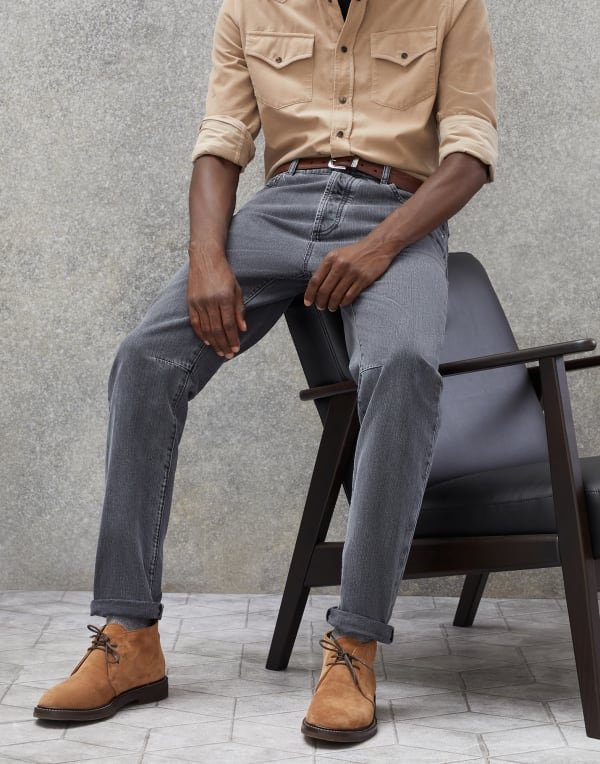
First, neutrals are always combined with other muted colours. In the image below, the blue shirt is pale and muted. It is this combination of a neutral with muted colour that best achieves the sophisticated minimal look that I like. A bright blue shirt would have worked as well, but the effect would be louder, less subtle and perhaps more playful.


Second, notice the ability of neutrals to lower the intensity of other colours. In the second photo above, a brown corduroy jacket is worn with a medium grey polo shirt. If the polo was white, the brown of the jacket would pop. It would appear rich and noticeably colourful. Paired with medium grey, the jacket stands out less. The overall effect is subtle, quiet and subdued.
The image below shows the neutralizing potential of grey as well. White pants can be hard to wear as they have flashy and fussy connotations. The muted grey jacket minimizes the contrast in the outfit, making the white appear less brilliant and stand out less.

Brunello Cucinelli
Finally, notice how muted colours are showcased when paired with neutrals. In a more colourful outfit, they would fade into the background. But paired with neutrals you can really appreciate specific and subtle blues, tans and browns. They are presented in their full depth and nuance. The result is an outfit without a high degree of contrast but that is nevertheless sophisticated and interesting.
Brunello Cucinelli

Rubato

